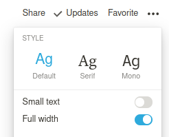
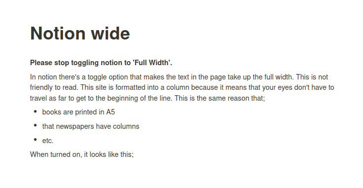
Please stop toggling notion to ‘Full Width’.

In notion there’s a toggle option that makes the text in the page take up the full width.
This is not friendly to read. This site is formatted into a column because it means that your eyes don’t have to travel as far to get to the beginning of the line. This is the same reason that;
- books are printed in A5
- that newspapers have columns
- etc.
When turned on, it looks like this;

Even if you make this image larger, and try and read the content, it’s incredibly difficult.

This is the same page, with the full width toggle OFF.
I have a theory that the setting is used by writers who have two windows side by side on their screen. Or writers who write predominantly on a small screen, like a 11" or 13" laptop screen. Toggling full width ON in this case would take up the “full width” of a small container, which is still not so wide that it suffers from the “hard to read” dynamic seen in the screenshots above. Setting to full width but within a small container is wider than the column view of full width OFF, but narrower than the wide view of full-screen full width ON.
This theory reminds me of the sites that were designed on a 32" screen attached to a MacBook, and are awful to use for all the customers on a 13" windows laptop using internet explorer.
Think about who will consume the page, and toggle full width off.